Chemists don’t just work with numbers. They interpret all sorts of information in graphs, images, and dense data. But our platform treated all data the same: tabular, static, and overly simplified, — each a distinct data point. When a top client asked, “How can I analyze microscopy images here?” — we realized we weren’t just missing a feature. We were missing a language.

In 2025, led the design of a platform-wide update that enabled Albert users to upload and visualize continuous and image data for the first time. This enabled sales to gain 4 new leads in the metals and paint industries, and enable better data accuracy for our entire customer base. Chemists no longer needed to ‘hack’ one-column fields to enter multi-variable readings.
Designed Across Multiple Systems
Cross-functional Collaboration
Our chemists needed a way to input, view, and validate more complex forms of data, including images of paint samples and continuous measurements like viscosity curves, as part of their daily R&D workflows. Lacking these capabilities blocked us from accessing new and larger customers with complex workflows.
Continuous Data Support
Modern lab equipment produce a matrix of continuous real-time data collection. Chemists previously entered viscosity readings as one data point, which created limited, error-prone records.
Image Data Integration
Chemists had tomanage the images in a system separate from Albert. Those working in paints and metals often rely on images, like photographs of surface finish to validate results.
Chemists need to generate reports manually, taking time away from experiments
Visualizing continuous data in Excel requires extra manual effort, and linking images to their corresponding results or formulas is prone to human error. This pulls chemists away from the bench and into Excel and PowerPoint, adding hours of cleanup and increasing the chance of reporting mistakes.
An example of continuous real-time data
These help chemists optimize their information collection and identify general trends. The data needs to be manually retrieved and visualized. An average is typically calculated from this information and recorded in Albert as one data.

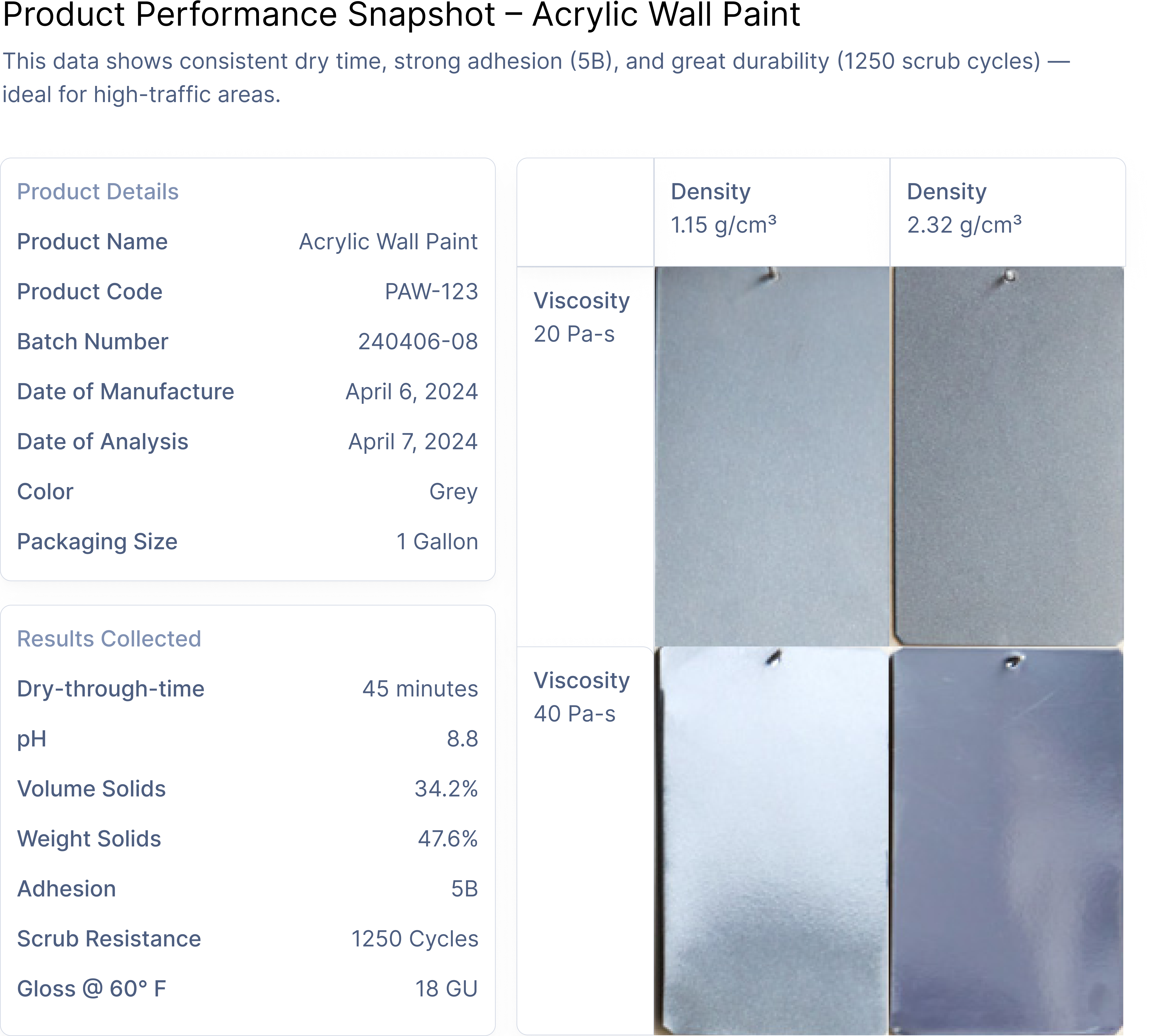
Image report typically shown during opening sales calls in Paint and Metals
Images documenting chemical performance are typically recorded in a separate database, making it prone to human error and wrongfully associated with the wrong formula iteration.
Configuring results and process objects impact the entire formulation workflow from beginning to end –– template set-up, data input, and insight output.
Our team sought out to fulfill the following principles
Make Input + Config Simple
Continuous data requires complex decision-making from our chemists to set up. This needed to be broken down.
Ensure Consistency
We were redesigning parts of 5 different experiences with this particular feature upgrade.
Show Actionable Insights
To enable more effective analysis for our chemists, we have to insert key insights during key touch points.
Design Challenges I Faced
I undertook this project in 4 weeks. Here are some of the things I worked through as I tackled the designs below
Many Impact Areas
We touched on roughly 4 product areas spanning the entire chemist's journey, all the way from ideation (worksheet) to insight and analysis (reporting).
Limited Time with Product
I was working with a product manager balancing a humongous load of projects, so I had to be quick and considerate with his time. Typically only two 15 minutes meetings every week
Simplifying Decisions
I had to map out complex decision points when it came to continuous data, and I had figure out how distill the most important pieces of info into elegant flows.
Template Set-up –– Matching existing config flows and simplifying complex decisions
Our current architecture allows formulas to be tested in tasks after you create a templated set of results (called Data Templates) and a templated set of experimental process conditions (called Parameter Groups). To reduce engineering overhead, I had to follow existing conventions and flows.

Configuring continuous data types
Since continuous data –– called curve data in the UI –– is structured differently across many types of equipment, I wanted to progressively disclose only necessary information as users make decisions. In the design below, we add configurable columns to the interactive table depending on the number of added result or process condition rows.

Data Input –– Ensuring workflow and interface consistency across four impacts areas
After finalizing the configuration flow, I had to figure out the upload flow and ensure that we consistently represented images and curve data across tasks, data templates, reports, and the formulation worksheet.
Ensuring consistency to foster confidence and familiarity amongst existing users
I made sure that the cell states in the entire end-to-end journey matched the product area that it belonged to, while having many functional parallels to the rest. I also avoided any full-screen for modal takeovers that tended to slow down our system down.

Templates –– Sample Table with Image and Continuous Data Columns
Where chemists and data managers set up the results.

Tasks –– Sample Table
Where chemists and technicians record experimental data.

Worksheets –– Sample Table
Where chemists and technicians formulate new materials and analyze experiment results.

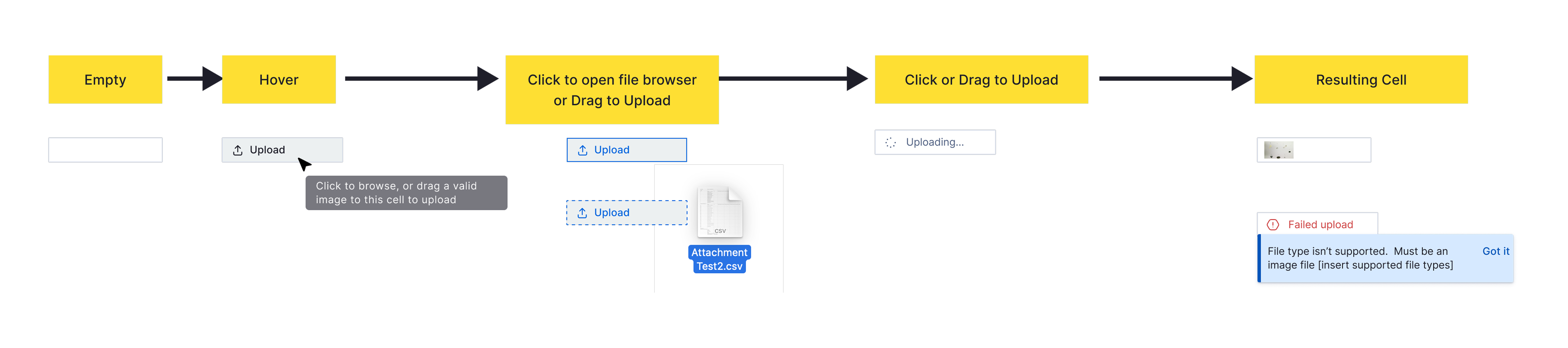
Ensure consistency in upload and delete workflows
Whether our chemists are filling up tasks, setting up templates, or formulating new materials, I made sure that each product area had exactly similar upload and delete flows.
Allowing data transformations on continuous data utilizing existing architecture
Chemists can preemptively shape and clean their continuous data if they upload a script to the template used –– which can then run automatic translations and ultimately making data more accurate.

Output –- Fostering better decision-making with timely insights
I designed the next few experiences with the intent to provide insight into image and continuous data across the end-to-end journey –– helping chemists make better decisions. I utilize existing architecture on our reports system and through modals.
Clicking into continuous data cells during result collection and when creating formulations
Reports on continuous data allow chemists to identify trends and optimize their equipment. During set-up, chemists have the option of setting the x and y axis attributes of the continuous data they are uploading. Given the nature of continuous data, I designed this report to be highly flexible, so I chose to render a scatter plot.

Clicking into image data cells during result collection and when creating formulations
When clicking into image cells, chemists can get a clearer preview –– allowing easier analysis and precise observations. I chose to show the previews without using modals and overlays, which would add an extra week of development time according to engineering.

Matching reports shared by chemists during the sales funnel with a new image-driven table
Image reports enable easy comparison of results across different process conditions and materials –– which chemists share to their customers.
In 2025, led the design of a platform-wide update that enabled Albert users to upload and visualize continuous and image data for the first time. This enabled sales to gain 4 new leads in the metals and paint industries, and enable better data accuracy for our entire customer base. Chemists no longer needed to ‘hack’ one-column fields to enter multi-variable readings.

